My Trend Stand at Domotex: The Design and Photos
I am thrilled to tell you about a design project that I worked on recently for Europe’s leading flooring and rug fairs, DOMOTEX, in Hannover, Germany. This was my second time working for DOMOTEX - the first was last year when they hired me as a consultant to help them form a blogger team and to get more social media presence on platforms like Instagram. Together, we developed a plan which included a blogger lounge, blogger tour of selected stands, and panels with bloggers moderated by me along with, of course, lots of fair coverage during and after the event by all of the bloggers. The first year was such a big success that they hired me for a second year to do it all over again, only adding a second day for the bloggers to be present at the fair, and for me to design my own stand around their theme for this year’s fair, “CREATE'N'CONNECT”. The stand needed to tie my life as a blogger, stylist, trend scout and journalist to their fair somehow. Would you like to see what I did?
Photo: Monsterscircus
Planning and Timing
First, I only had a few weeks to develop a concept and pitch it to them, then a few more weeks to figure out how I would get everything together to make deadline (shopping for products, deciding on stand design overall, paint colors, flooring, special features, etc.), then a few more weeks to finalize everything with Schmidhuber (and also Domotex) who were responsible for hiring the contractors to build the stand could get it up in time for the fair. The firm, Schmidhuber, is based in Munich so after our initial first meeting in Hannover, only email was our primary way of setting plans in place. But, because they are so professional and organized, it all worked out relatively smoothly because once I had my vision, it was easy to direct them as to what was needed in order to complete the stand. It was such a pleasure to work with them, particularly Susanne Schmidhuber, Martin Lersch and Veit Penzenstadler. Top!
The Hardest Part
I think the hardest part about the stand was to visualize it because Christmas break was looming and so I had to get it all finished in advance of the holidays while also engrossed in the the final planning and work on my design project with DEPOT (I created a collection for them to launch January 31 in stores and online) and my magazine project with LIVING AT HOME x Holly which was as exhausting to wrap up as it was exciting. A bit like the weeks before a baby is born, or your wedding. Fun… But a lot of “Oh My God I’m Tired”, moments! Another hard part was trusting my gut. My first vision is exactly what you see in these photos, and because I had no time to make any changes, I was forced to take my first vision and not to edit, edit, edit as I so often do in my home where there are no extreme constraints on time. I learned, once again, that my gut knows best and that I shouldn’t second guess myself and just execute on my initial plan. I will apply this to more projects going forward.
Photo: DOMOTEX
To say I was exhausted before the holidays is indeed an understatement. I was so tired and overwhelmed I got hit with a horrible dose of bronchitis and sore throat - some nights I couldn’t even sleep because of the pain.
Did I Learn My Lesson?
Yes. I learned that I will most likely do it again and again and again because I can’t say NO to such amazing projects - ha ha - I love the adrenaline rush but also the feeling of accomplishment. BUT. I really did learn that next time, I will utilize my assistant Jessy more and even hire another local assistant (Jessy lives in Malta) to help on the things that take so much time that I don’t really need to be involved in. Delegation is hard for me but I’m learning.
The Best Part
The best thing about the DOMOTEX “decor8/Holly Becker” trend stand was that in the end, it was truly beautiful and I felt it was a success - so I’m very, very pleased. As you know, I had a stand at the imm in Cologne exactly two years ago, and a stand with Annabella in Bologna at the Il Mondo Creativo craft fair (thought I did nothing to design it, she did it all herself) last year, and I’ve been curating collections for Formland at a mini trend stand where they have trend setters showing their SELECTED BY favorite fair products (and another next week where you can see my favorite products on display again from 31 Jan - Feb 3), but to design a complete stand from the ground up as I did for imm was very exciting because it’s 100% your own project from a creative standpoint.
Do I Like Designing Stands?
I thought I wouldn’t enjoy it, but after a few experiences behind me, I discovered that I actually love stand design because it’s exciting to see my vision come to life which, in turn, can inspire people visiting a fair in a new way - in a creative way. I would like to do more, especially for some of my favorite brands. I see so many brands at fairs who really need the vision of a stylist to make their products really stand out and also be more Instagrammable so people are motivated to not just visit them on the fair, but to take photos and share on platforms like Instagram. This is such an amazing marketing tool for them to tap into - to create stands that people want to photograph and share on social media.
Photo: DOMOTEX
My Concept
For this stand, because the theme of the fair was CREATE'N'CONNECT, I wanted to show how people are working online each day CREATING content (home design, styling, etc.) and then how they CONNECT with people globally through their networks to inspire them to live a better life, or simply to decorate in a new way using the things they are sharing.
I wanted to show, in the stand, a wall of inspiring bloggers who are doing this daily so I selected the bloggers whom I invited back again this year to work with me on my blogger team at DOMOTEX: Igor Josifovic (Germany) from Happy Interior Blog, Agata Dimmich (Italy) from Passion Shake, Niki Brantmark (Sweden) from My Scandinavian Home, Stefan Nilsson (Sweden) from Trendstefan, Desiree Groenendal (The Netherlands) from Vogesparis and Mette Jakobsen (Denmark) from Monsterscircus. We also had two new additions to our team, Michael Christie (Canada) from The Ruggist and Camillia Bellini (Italy) from The Diary of a Designer.
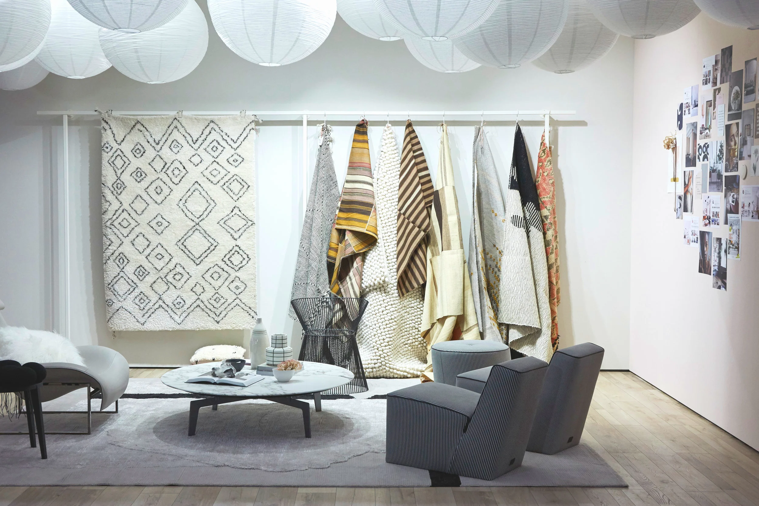
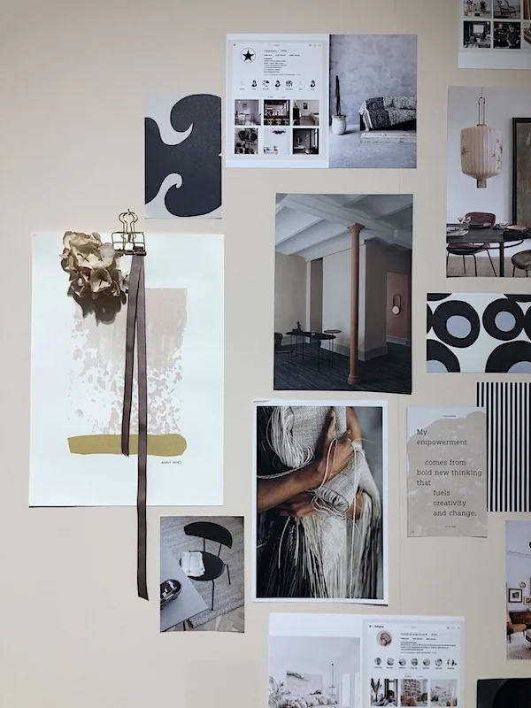
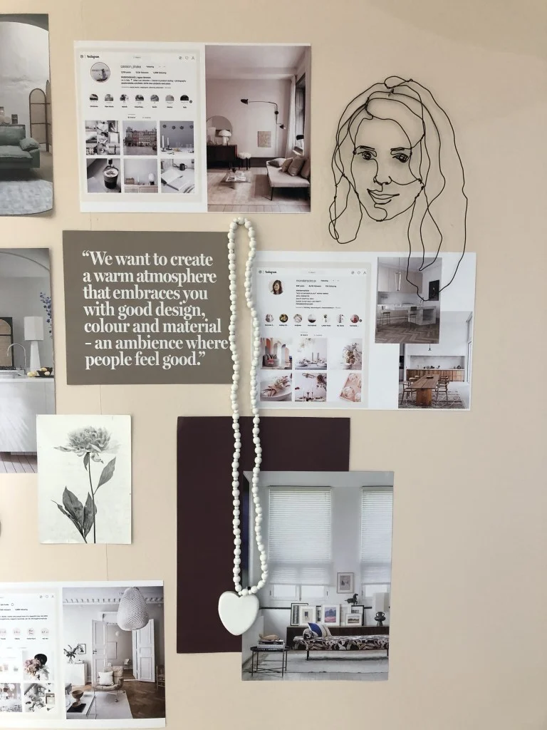
On one wall, I had a mood board using clippings from Bo Concept, Bolia, Bolon, Marrimekko, Ferm Living, HK Living and Bloomingville catalogs along with screenshots of the Instagram accounts from these wonderful bloggers. This was my way of showing how we are sharing things that we love each day online in the simplest way possible while still allowing the booth design to remain clear and stylish.
I also wanted to show in the stand how the stand itself was going to become content for my own Instagram (and for many others who visited the fair and photographed it), and would connect people to the fair through the photos created for Instagram (and now, my blog).
Photo: Domotex
Photo: Vogesparis
Photo: Vogesparis
Photo: Vogesparis
Photo: Vosgesparis
The Rugs + Overall Design
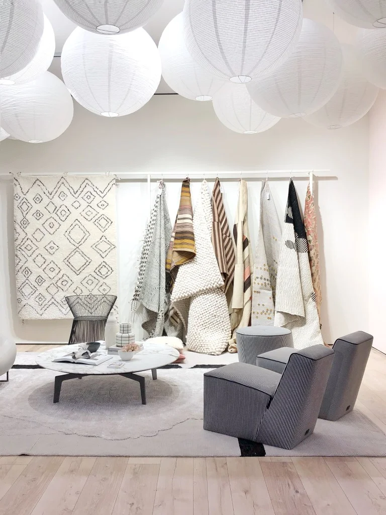
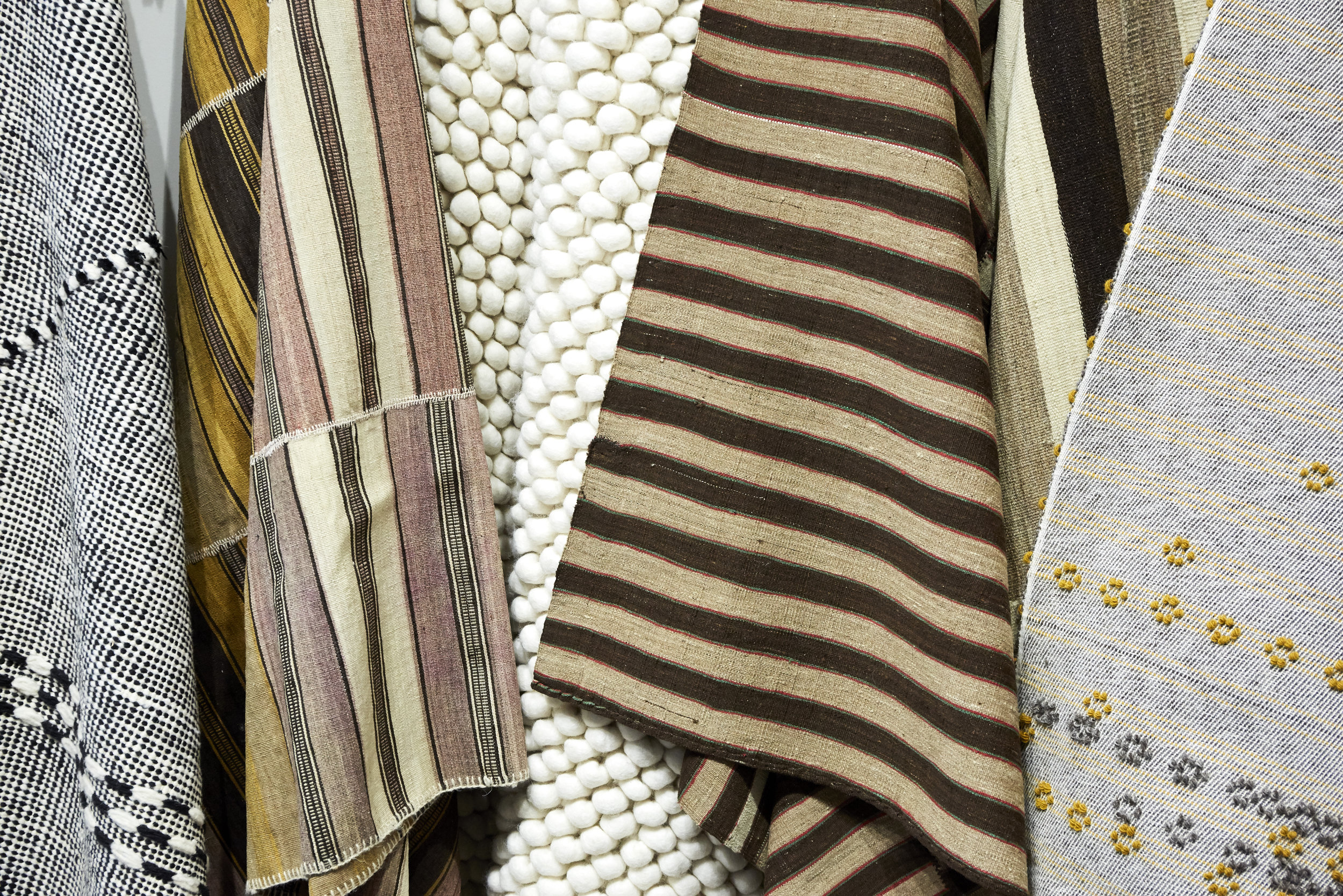
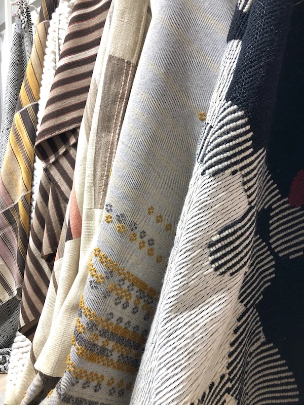
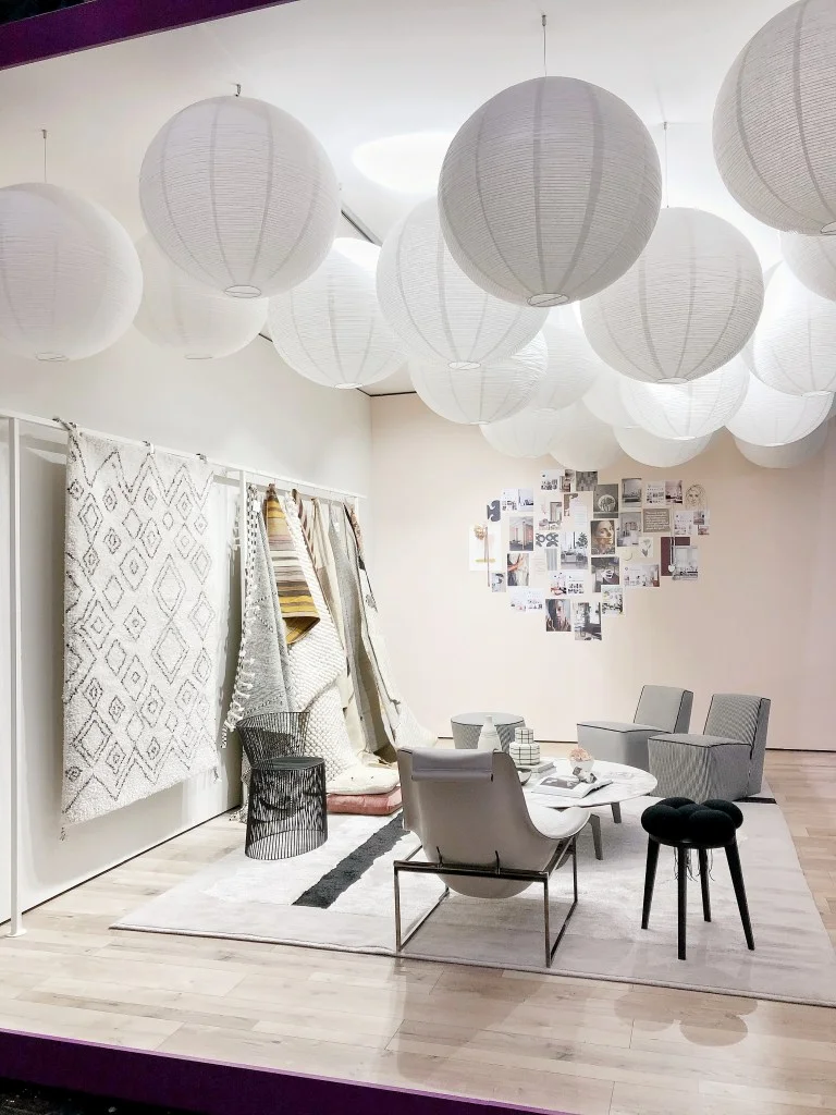
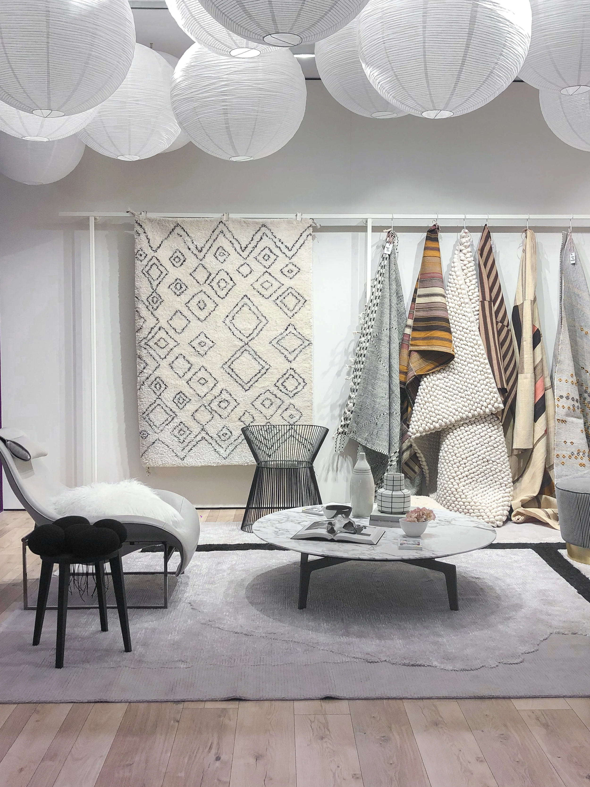
Because I only had two walls, I decided to use the largest wall to display some of my favorite rugs from DOMOTEX vendors (plus one vendor from last year): Edelgrund, Tisca, Mariantonia Urru, Bazar Du Sud and Natur Pur - to show rugs that I love and how I imagine them “living” in a room - the type of setting I would use them in. Please visit each of their websites to learn more about these gorgeous rug brands, many of them have won awards and are working in amazing ways - some with undyed wool, others are restoring vintage pieces and still others are working with artisans to handcraft each rug.
The rugs I shared in my stand are all with a story - and from the heart. I hand-picked each one of them and Mariantonia Urru was nice enough to ship two rugs all the way from Sardinia, Italy just to be part of the stand since they couldn’t be at Domotex this year. I was so honored because I LOVE their work.
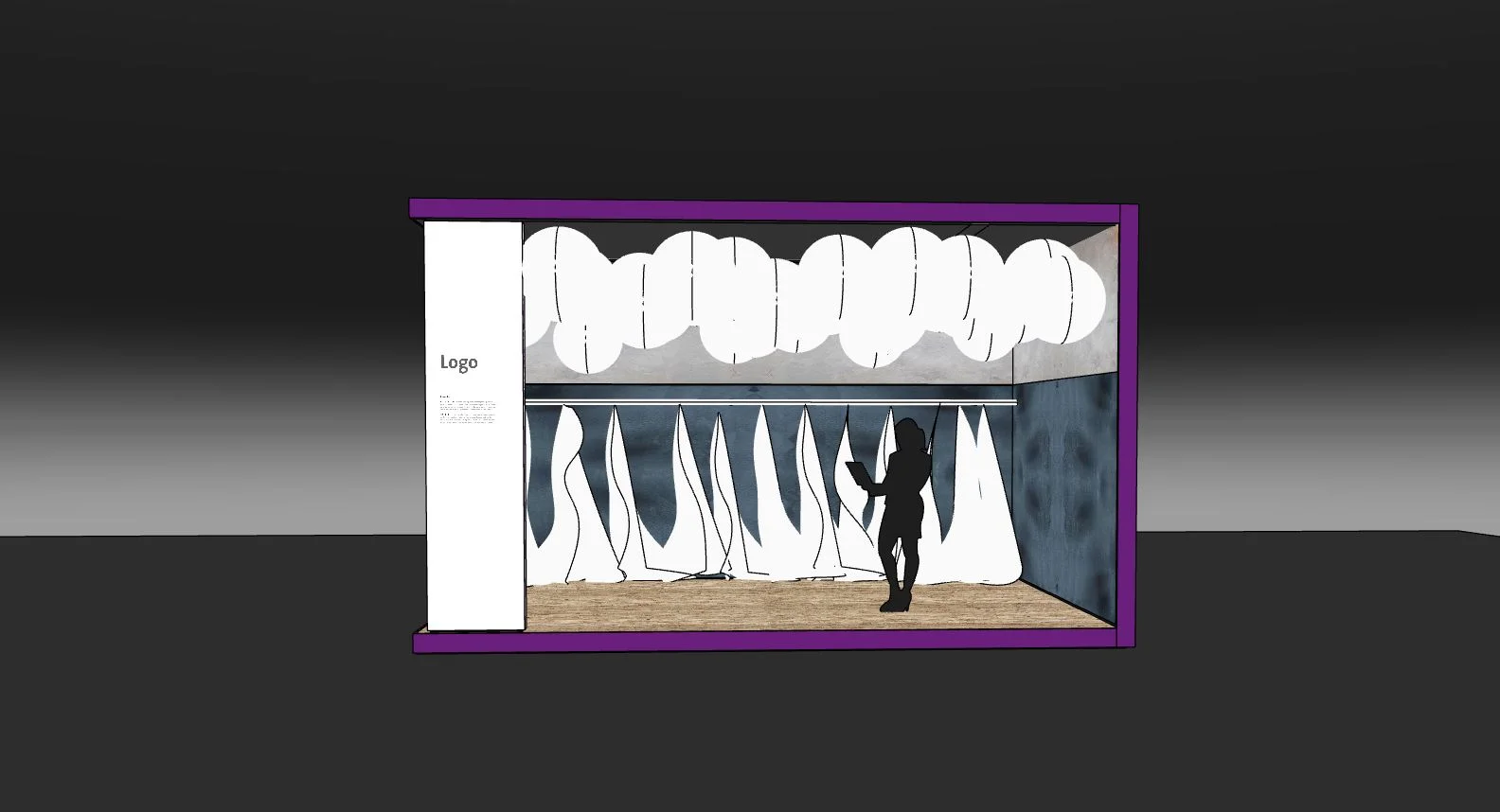
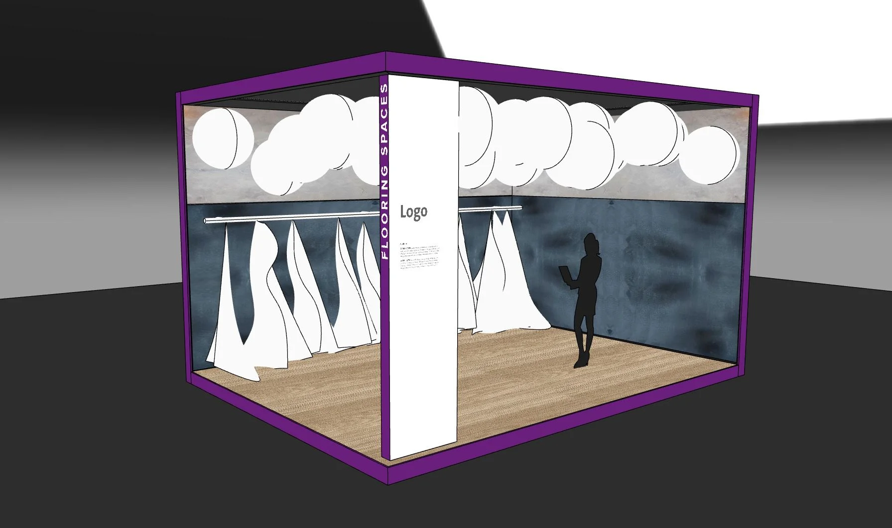
The interior design of the space was my opportunity to show the type of room these rugs would fit.
The idea was to stimulate fair visitors to try to visualize rugs in a modern, fresh space even if the rugs were Boho style, or maybe very pure and natural, or even vintage or handmade as my rugs all were at least one of those things. I thought of the rack as a nice way to show these rugs and though my intended vision was to show 12 rugs hanging on the rack, because some rugs were very thick and heavy, I couldn’t show them all in this way so I had to show less rugs and hang one as art since it was too thick to drape, so it actually came out better than my intended plan. A happy accident for sure!
Photo: Monsterscircus
Furniture
The interior design was so fun, I was told to find partners to work with to “loan out” furniture for the fair but I couldn’t imagine, with such short notice, that I could go to 3-5 brands and call in furniture as I would typically do for a magazine shooting. Instead, I went to my favorite furniture store in Hannover called Steinhoff, owned by the well-known designer Anard Steinhoff who also has Germany’s Smallest Design Museum on the top floor which is quite inspiring and cool. I asked them if they’d loan me ALL of the furniture so the process would be really smooth and easy for me. They agreed and I was so, so happy to work with Anard Steinhoff, Pola Sirowatka and their team.
I met with them a few times and then I spent several days and many hours alone at the store, combing through floor by floor, taking breaks to think and sketch out my ideas, and looking again. Steinhoff is huge and has 4 floors, and hundreds of gorgeous pieces. I found a fantastic B&B Italia chair on the 3rd floor in a corner, the perfect coffee table on the 3rd floor in another section, and my DREAM rug by Baxter on the first floor along with some chairs and stools that I loved. Then, I drew up a floor plan and asked their Interior Designer to render everything to scale so we could send it to the architects in Munich who would then render it in 3D and show me how the stand would look in real time.
I intentionally selected furniture that would make the room feel very welcoming, while at the same time, not look like a space where people would really want to hang out and chill because had I used a big, comfy sofa, I knew people at the fair would think it’s a lounge space to go on wifi and I didn’t want the stand to be a mess by the end of the first day. So I selected furniture that was beautiful but that didn’t scream out, “Come sit on me and spend the day surfing your phone!”. ha ha.
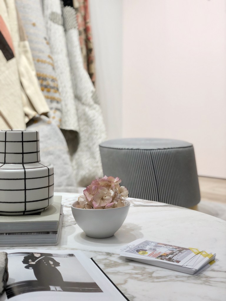
I also wanted black and white stripes and small stools and chairs, because I sensed this would be a trend (lots of small tables and chairs (and sure enough, at the imm last week, this look was everywhere and even the rug was the first rug on display at the Baxter stand!). I also sensed marble would be a big trend for 2019, which is why I went with a marble table. I also had to have black and cream as the base, with a natural wooden oak floor, because I felt with the mood board and colorful rugs on the walls, that I wanted the sitting area to not be too strong and bold since the walls were the real focal points.
As for the boho modern look, it’s my favorite look at the moment so I stuck with it. It marries my American aesthetic (very LA/California fresh) with Scandinavian and a touch of Morocco. I really love this look, as it comes across as stylish and well-traveled.
NOTE: If you have any questions about the individual pieces of furniture, please ask me in the comments section and I’ll contact the store to get all of the details - designer, make, price, etc. Or you may contact Steinhoff Hannover directly.
Photo: Passion Shake
Wall Color + Flooring
This was very easy, I went with a white ceiling, and for the walls, I knew to partner with Farrow & Ball Germany because they are always so amazing to work with but beyond that, they also have the most gorgeous colors. I selected Pink Ground for the moodboard wall (I have this in my own home so I knew it would be perfect and cast a warm glow) and for the largest wall, I wanted the perfect white so I selected their newest white called Schoolhouse White and it was absolutely perfect.
Overhead Lighting
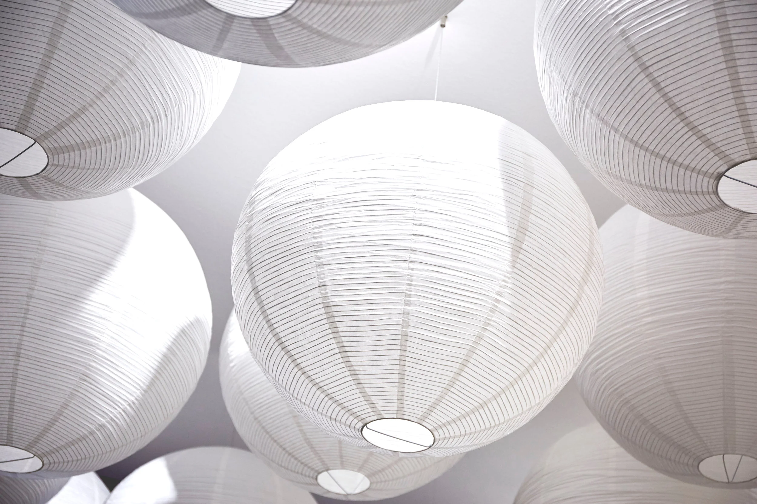
The lighting was an idea I had for awhile, that I wanted to do for Aidan’s birthday party a few years ago, but I found it too elaborate to bother for a few hours for toddlers and cake. I saved the idea in mind and decided one day, I could bring it to life. Finally, I could do it - and I knew it the moment I saw my stand in a PDF with all of the dimensions - and that I actually had a real ceiling in my stand unlike my stand at imm which didn’t have a “top”. The space was large enough to put this plan to action, but also small enough to not look crazy or over-the-top.
Anyway, last year, I saw the Noguchi Museum on Instagram, where they have paper lanterns on display hanging at many different lengths, and I thought that this original idea really would work because if the they can do it, well so can I. Only, my idea was to group lanterns all the same size in pure white, and hang them at the same length, to create a sort of soft dramatic statement while also being cozy and most importantly, to diffuse the light from the typical fair spots that are often so harsh (and ugly). I also wanted lighting that was very affordable - these paper lanterns all came from IKEA. I decided that I did not want them to be illuminated, I wanted them to not have bulbs inside and instead, to take on a soft glow from the spot lighting beneath them, so people would be encouraged to take photos.
I heard many comments from passerbys, and even the blogger team, that they really liked this idea and felt inspired by it and on Instagram, many people were writing to me about it saying they loved it - so the reaction was exactly what I had hoped for and I’m glad I went with my gut feeling on this one.
Photo: Monsterscircus
Photo: Monsterscircus
Creating Impact
Back to the lights… I wanted a “wow” statement because I believe that when you do a styling job, you have to make something stand out, something needs to be the “wow” or else it’s just another interior design “room” at a fair stand. You see hundreds of mock up rooms on fairs - beautiful spaces that look like showrooms from a furniture store. A stand at a fair, in my opinion, gives you a chance to take it to another level - something you most likely would NEVER do for a client or even in your own home or even in a furniture showroom because a fair is lasting only one week and because you WANT people to talk about YOUR stand so it needs to really have impact. You can do this through so many ways, my way was to make the rugs and the lighting draw people over to the stand to explore more.
But back to impact. Imagine having this many paper lanterns in your living room?! NEVER EVER, right? Too much dusting. I think of a fair like I do theater - be a bit theatrical and play. If I had more time, I imagine I would have really pushed my limits because I’m at that place in my life where I want to push more - but the lanterns made the statement that I wanted to make - and they lured people over to see the stand because once you saw them from afar, you had to get a closer look to see what’s going on.
Accessories
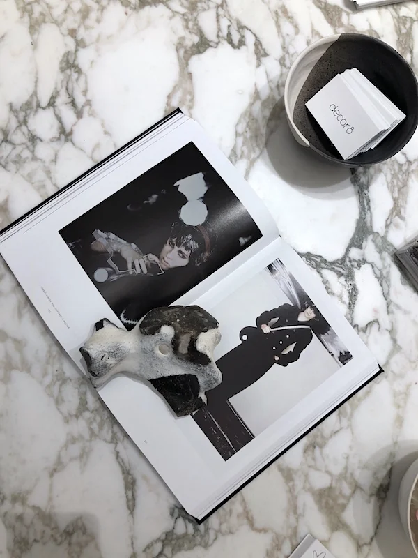
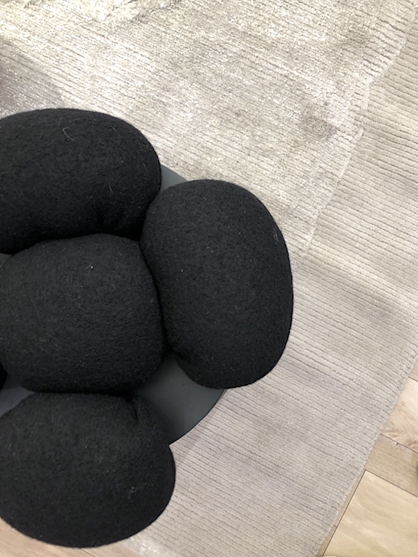
In addition to the moodboard, I added some things from home like the wire portrait of my face since line drawings are really trending at the moment, wooden beads, vases, bowls and books (Chanel - Karl Lagerfeld - Die Kampagnen, my first book Decorate (only in the newly released Dutch edition with the beige linen cover), and This Is Home by Natalie Walton) on the coffee table and some pillows for the chair and floor. I wanted a piece of myself and my life present to warm up the space and make it feel like home. In fact, I loved the stand so much more once the mood board went up and some of my personal objects were laid out on the coffee table.
Suddenly, the space came to life.
I was happy when opening day came and I could share it with all of the Domotex visitors and the press. To my excitement, my stand was on television two days in a row on the subway here - showing on all of the televisions on the train platforms and in the trains and I was interviewed and on TV too, which made me very happy to represent my own brand but also Domotex, in such a positive way because I love this fair so much and the people I work with there.
Special Note of Thanks
I’d like to thank Domotex (Dagmar, Lars and your team), Steinhoff, Farrow & Ball, All of the rug dealers who loaned me these gorgeous rugs, the blogger team and especially Schmidhuber for making all of these ideas of mine a reality and to Veit Penzenstadler who was SO helpful in making sure I had my rugs, hooks, and lanterns in place for opening day - thanks a million everyone! It was a great experience.
Love,
Holly

