6 Minimalist Kitchen Ideas
I love spending time in my kitchen, whether it’s making my morning cappuccino in the sunshine or whipping up a yummy cake batter while my son draws at our tiny retro vintage table. I laugh when I think of how the three of us squeeze around our table for most of our meals. Sure, we have a large dining room, but being together in the cozy kitchen is always our first choice in spite of how cramped it is. We have a very typical “altbau” German kitchen from 1900 - back then kitchens and bathrooms were kept small to allocate more space for all of the other rooms. In our apartment, the staff slept in the back rooms while the owners stayed in the front with our tiny kitchen dividing the space along with our exceptionally large entry room.
Because my kitchen is so small and narrow, I have to make use of the space in the best way possible. I’m often frustrated, dreaming often of the American kitchens that I left behind when I relocated to Germany 12 years ago. This leads me to why I’ll soon be renovating my current kitchen, taking a more minimalist approach will help me to maximize the small space.
I hope for new cabinetry doors and hardware, a new floor, a different work surface, a much smaller oven and stove top, different lights, new wall paint color and my free-standing refrigerator to be sold with a new one hidden behind doors for a cleaner look.
As I’m in the midst of redesigning things, I’ve been thinking along the lines of keeping it ultra minimalist to optimize the space - in a visual sense to make it cleaner and more open, and in a functional sense - to make things very easy to find yet concealed, not have more than I need, and to eliminate small appliances and open shelving that only collects dust and grease.
Minimalism helps us to focus on what’s important, what is indeed necessary and allows us the permission to remove what isn’t. It’s best to prioritize the function of your kitchen first, then consider the way it looks. In my approach, form always follows function - I cannot have function without beauty or beauty without function.
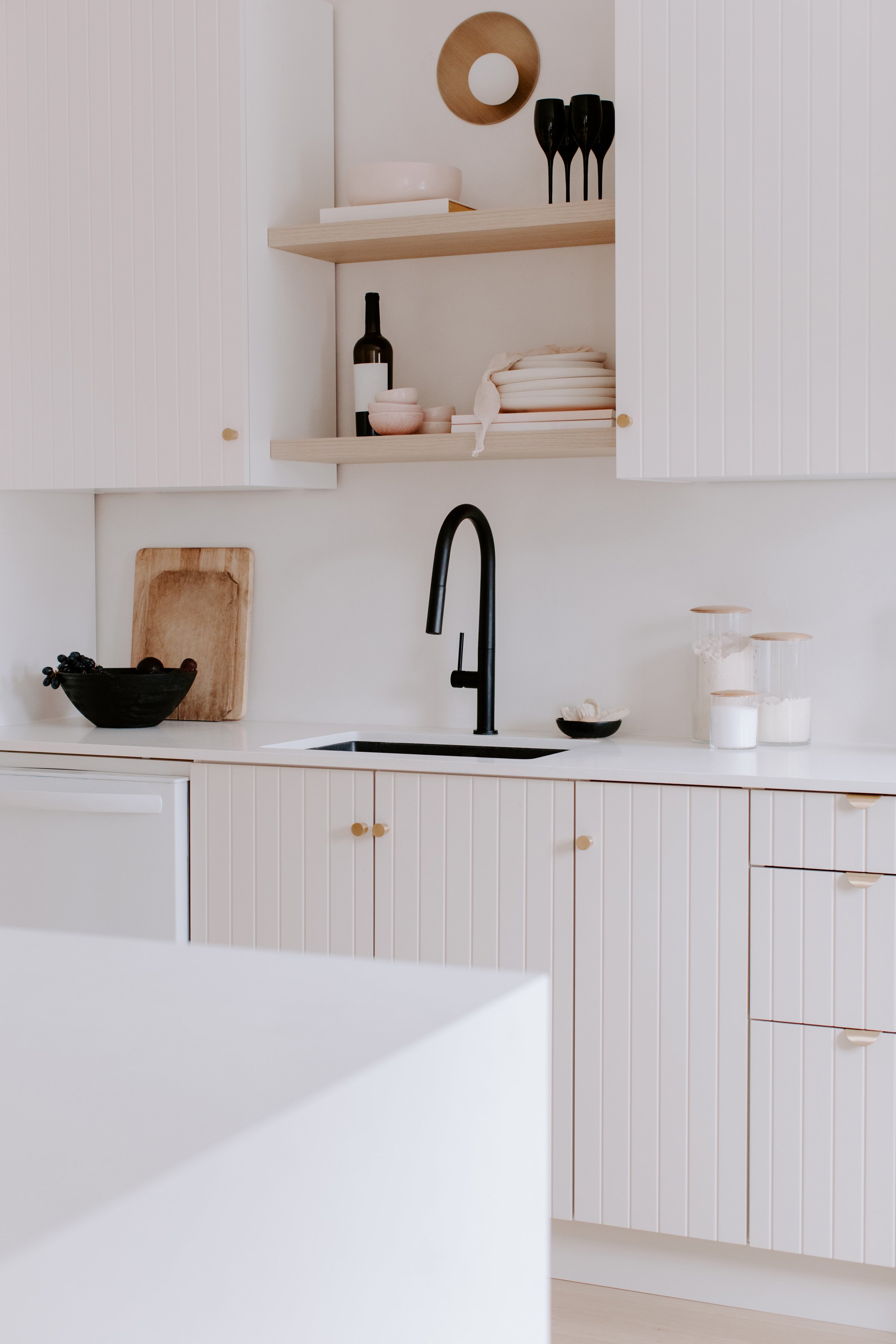
Common elements of minimalism for kitchens currently include: neutral colors, simple storage, hiding as much as possible behind cabinet doors, no visible product labels, clean lines, natural light, clutter-free, open space (negative space), a plant or some flowers but very limited - not a “jungle”, a very limited color palette, not a lot of extras or “fuss”, sinks that are very streamlined, open shelving that is kept spare and clutter-free, small appliances (toasters, juicers, etc. are kept hidden in a cabinet).
Additionally, here are 6 minimalist kitchen ideas to aid you in designing yours in a more streamlined way. I will be adhering strictly to these myself. Ready?
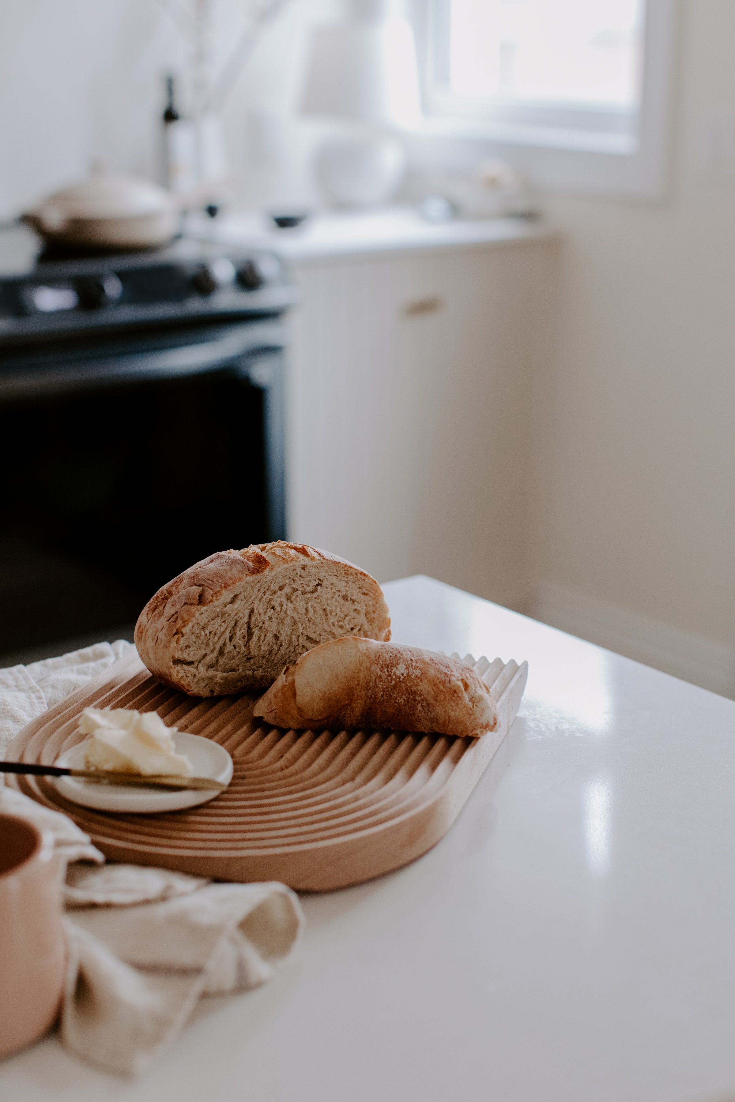
1/ Store small appliances that are not used daily. For example, I don’t use my waffle iron, toaster, juicer or Kitchenaid daily, so they are kept behind closed doors. Only my cappuccino machine is on the countertop.
2/Use open shelving sparingly. I see this a lot in kitchens with open shelves - people tend to load them with “things” and the kitchen feels cluttered and messy as a result. It’s best to only put items on your open shelves that you use very often because they collect dust and grease so “storing” things on open shelves doesn’t work - only keep things there that you wash frequently from use. Open shelving is also a nice place to place a plant or some fresh flowers and a few tea towels neatly stacked. Don’t feel like you need to fill open shelving. Less is more.
3/Hide the oil and spice collection. My kitchen has this problem currently, too many oils and spices by the stove. They collect dust and look messy and dated - I don’t use all of my oils each day, in fact, I use mostly olive oil which could be easily placed in a cabinet by the stove and removed when I cook. I’m not a chef cooking all day, most of us aren’t, so why take up counter space with tons of oils and spices? I have a spice drawer yet I still tend to corral my spices near the stove even though I don’t cook daily with them. Even if I did use them, the drawer is sufficient enough. I think this is a bit old school - like something our mom and oma once did that we need to put to rest now. Who needs all of these things by the stove. Are we cooking constantly, 7 days a week, for large families? Most of us aren’t. Some of us cook one hot meal a day, max. I also want to add to this the typical jar of utencils, spatulas and whisks in pottery jars… Place them in a drawer.
4/What do you really use and need? This is a great question, right? Look at everything in your cabinets, on the countertops, under the sink, in the pantry, in the drawers and on the open shelving if you have it and ask, “Do I even use this!?”. I have things that I never use yet I somehow justify keeping them - like my martini set. I’ve never made a martini in my life, I doubt I ever will, why do I own a set for this? Or my bartender tools like a measuring cup and stirrers, please, I dump in the amount of alcohol that I want in my cocktail and stir with a long cappuccino spoon. I’m just not fancy enough for all of these bartender tools so why do I have a drawer devoted to them? I even have cocktail books, why? I have a cocktail maybe 4x a year, and most of the time, it’s not even in my house. When I have alcohol, it’s usually wine, Prosecco, or my favorite - Veuve Clicquot, or in summer I make Aperol spritz or a gin tonic with cucumber, rosemary and mint - which I can make with my eyes closed. My point is, I don’t need bartender tools cluttering my drawers. How about you? Be honest and look through everything. Create a box for “giveaway” and another for “throw away” and use them! :)
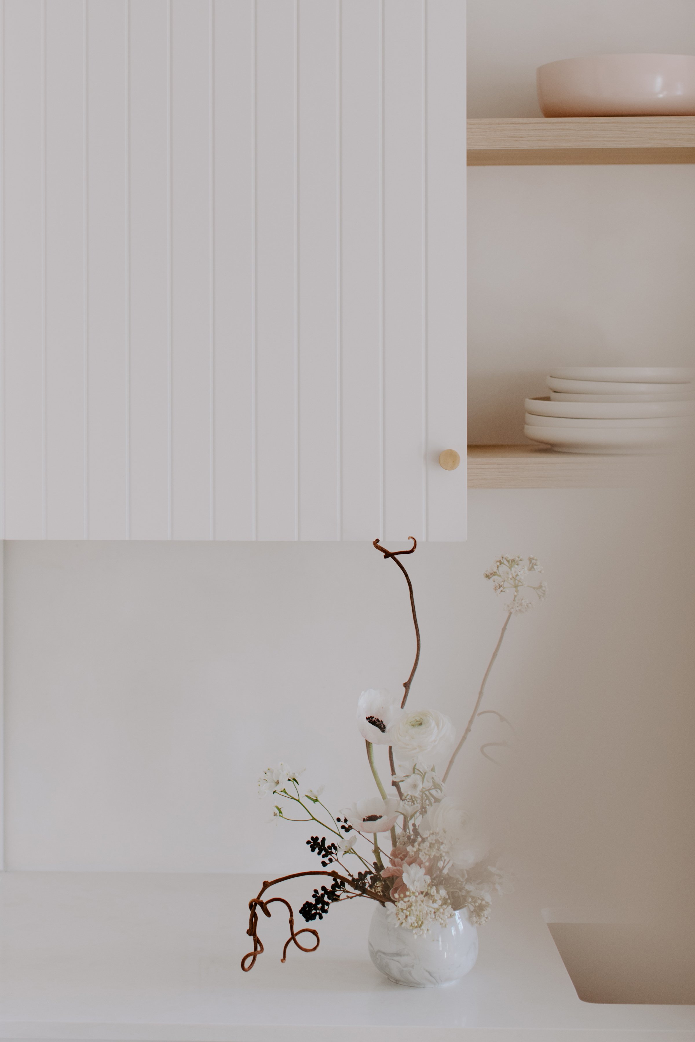
5/Keep everything neutral. It’s tempting to have a mint green SMEG fridge and a bubblegum pink KitchenAid on your countertop, and if you like yours then you really SHOULD have those things and skip this blog post. But for a minimalist look, everything needs to go very neutral, or as color lovers will say, very boring, ha ha! Most opt with natural tones - and stick with beige and black or beige with some terrazzo in neutral colors (I love this combo) or marble and beige… Or bring in dark wood with marble for more depth and contrast. Colors like khaki, sage, pale apricot, gray, black and sand tones are all minimalist-approved colors. The idea is to avoid primary colors like screaming red and under-the-Tuscan-sun yellow and blue. Even your flowers should be neutral - red poppies - NO, white poppies with black centers - YES. Or plants, though a spider plant isn’t seen as minimal, so look for a plant that has a simple shape and doesn’t grow all over the place shooting out in different directions. Yes, even the plant needs to be minimal. I know, I know - sounds all so crazy on paper but in practice, the look can be calming, relaxing and give way to enhanced creativity and joy because less visual clutter can be a very positive thing for the mind. You may even find yourself cooking better without so much visual distraction around you. Look at a proper chef’s kitchen. My father had one so I have experience with this as he was a cook and owned a few restaurants alongside of his daytime career. His kitchen was immaculate. Streamlined. Clutter-free. You can’t chop and prep balancing a cutting board on the edge of a counter because you have no space - your cookbook collection and spices have crowded you out. Store them and make room for what a kitchen is really meant for - cooking, gathering and eating!
6/Maximize natural light. I have simple plisse blinds on my two kitchen windows in white - they are barely noticeable but I use them in the evenings or to filter light on summer days when the kitchen is boiling (we have no air conditioning - I live in Europe remember). For a minimalist kitchen, it’s best to remove curtains and anything fabric on the windows - keep only a simple blind or shade that is easy to clean and barely there. If you don’t need privacy or to filter sunlight, don’t put anything on your windows, why bother? Your kitchen will look even brighter and cleaner with natural light!
Have fun working on your minimalist kitchen redux!
(Photos: Studio Bicyclette)


