fresh finds for hip spaces

Home
Stylist Irina Graewe

Good morning! There are so many great things to share with you this week so let’s continue with more inspiration, shall we? I briefly mentioned German stylist Irina Graewe back in 2008 but I was reminded of her dazzling portfolio again yesterday while reading Sodapop. I think you will really flip over her so please join me for a peek because her endless talent is bound to inspire and pick up your mood today! She shares several themed collections on her site, so I encourage you to visit her to view them all. I’ve selected three of my favorite themes to share below.

Stylist Irina Graewe

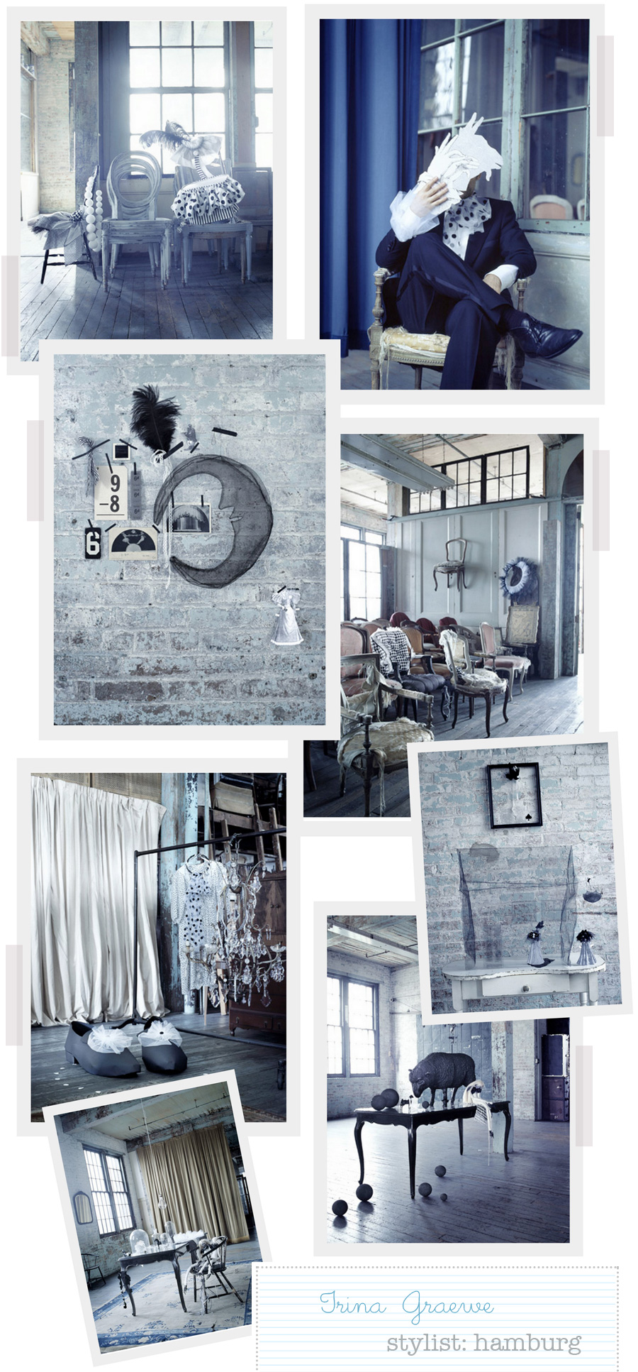
The first is called Bonjour Tristesse. I love the inky blue and gray tones — so moody and sensual. Notice the big shoes next to the clothing rack. Are those not the best?


Stylist Irina Graewe

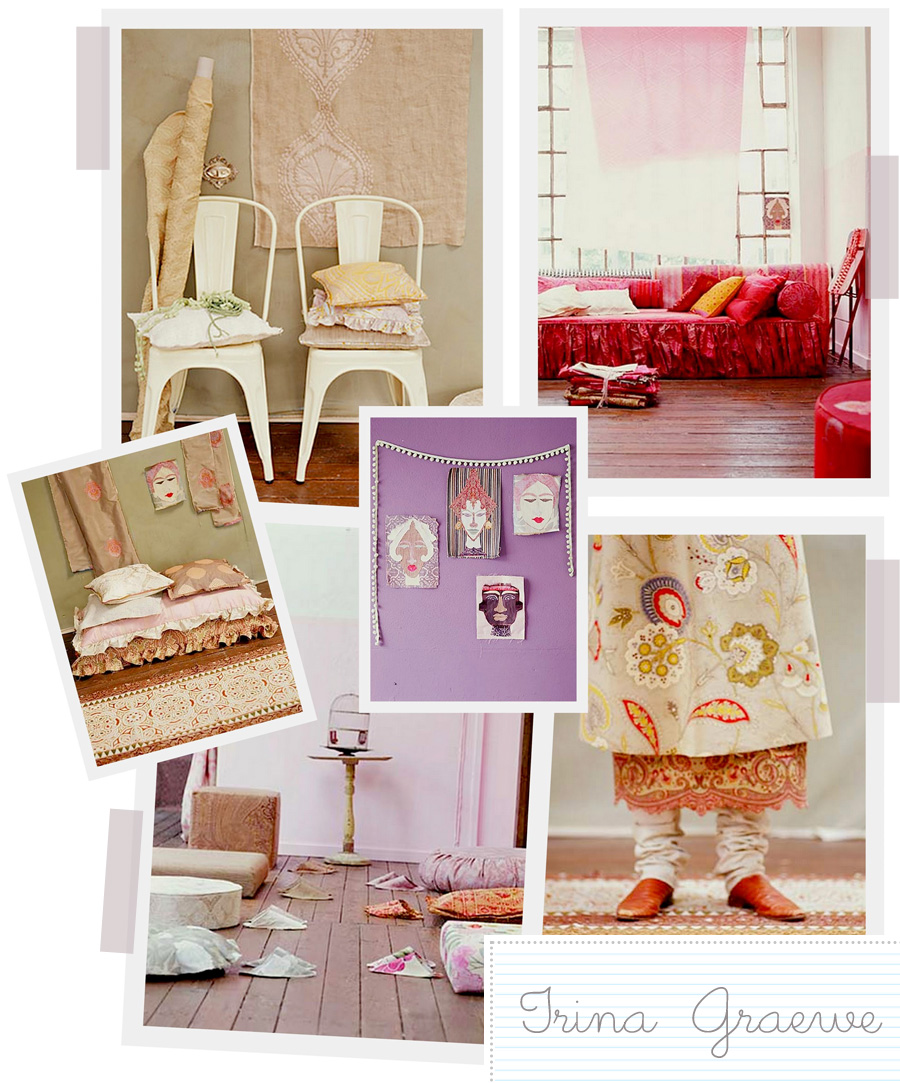
I also love the mood in her Patchwork collection of pinks and neutrals along with ethnic prints and patterns. I think my favorite is also the most simple arrangement of the four portraits tacked to the wall with a simple string of pom pom trim in an “L” shape placed very casually near them as a partial frame. These little adds are so interesting to me, I tend to pick these things out when I look at photos to try and figure out exactly how a mood was created and what about an image pulled me in. These images above are quite alluring don’t you think?

Stylist Irina Graewe

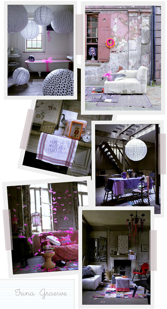
And lastly, her Culture Club ensemble is another favorite in and lots of pretty pink but mostly for the feathers all a-flutter and the huge rice paper lanterns, you can find these from IKEA in white and decorate them with black dots to create a similar look for a few dollars (they are so cheap, I have one in my living room and it was around 5,- Euros).

Irina got her start as a tailor for Jil Sander in Hamburg and then relocated briefly to London to attend the London College of Fashion. Upon graduating, she realized her true calling was not in fashion but interiors, so she relocated back to her home country to pursue a career in interior styling and set design and her work has appeared in top magazines throughout Germany so unless you read them you may not have heard of her before — which is why I felt even more inclined to share her on decor8! Her work shows her passion and eye for detail and a whimsical approach which is so appealing to me because interior styling becomes a bit dull when it looks too perfectly arranged in my opinion.

What do you think of these images that I’ve shown you from Irina’s portfolio? Does anything in particular about them, from the colors to arrangements and beyond, connect with you on a personal level? I’m surprised at how drawn I am to the first collection, Bonjour Tristesse. It’s not something I’d normally gravitate towards but something about it feels very cinematic – I can almost put a story to them — can’t you?

(images: irina graewe)

Tags:


44 Responses to “Stylist Irina Graewe”

  1. 1 Will commented:


    I am in awe of her work, these photographs are stunning. Thank you for sharing them.

    My favourite is the third collection; I like the ‘home is where the heart is’ teatowel and the petal drop is very wistful and evocative.

  2. 2 Jenny commented:


    Gorgeous! I want it all!
    .-= Jenny´s last blog ..Where are you? =-.

  3. 3 Heather commented:


    Yes, it’s very dramatic and yet, meloncholic and…cute, at the same time. I’m not usually one to use the word cute when referring to someone elses work – it seems almost rude, and yet, from her work, she does seem to have a childlike playfulness in the way that she presents colour. I love it.
    .-= Heather´s last blog ..and now for some quiet time… =-.

  4. 4 Ana commented:


    All the work shown is great. I do like a lot the blue and gray series – they remind me of winter days, that I love so much (Ok, you can kill me know!)
    .-= Ana´s last blog ..Blogging Your Way e-course – Week 3 =-.

  5. 5 Karen (another one) commented:


    Irina is one of my worldwide favourites!

  6. 6 Leeann commented:


    Love, love the first collection – c’est parfait!

    Leeann
    .-= Leeann´s last blog ..Love, love, love…. =-.

  7. 7 anna shoub commented:


    I love those blue and grey inky tones. I think that can be so dramatic with one splash of vibrant colour.
    .-= anna shoub´s last blog ..Spring is Coming =-.

  8. 8 Die Frau im Haus commented:


    I’ve been watching Irina’s Work for quite a while. I love her work!

    In the March issue of “Schöner Wohnen” you can find more of her.

  9. 9 Flourish commented:


    I don’t want to say that I have a favorite because they are all A-M-A-Z-I-N-G!!! But the pic with the chandelier is just fab. SO LOVE!!!
    .-= Flourish´s last blog ..{Nesting Newbies Magazine} =-.

  10. 10 The Design Notebook commented:


    Absolute stunning images and brilliant work. Such a talented lady. The first collection is my favourite. I don’t know what it is with blue at at the moment but it’s really pulling me in.
    Thanks so much for sharing!
    .-= The Design Notebook´s last blog ..Guest Blog: What does your decor style say about you? =-.

  11. 11 Nataschia commented:


    I love the warmth of the patchwork collection… my favourite from that set is the different pillows with the matching slippers. all the same-yet all different.
    Love her work-thanks for sharing!

  12. 12 doreen commented:


    Her work is artistically inspiring. She is a master of color and scale. The images are quite theatrical, more like a fantasy than real life. Very fun to see.

  13. 13 Natalie from MD commented:


    Great blog for inspiration!

    I feel connected to the last collection, Culture Club. Something about the whimsical, colorful, eclectic styling. And the dish towel “home is where the heart is” is something I am truly learning at this point in my life.

  14. 14 ishtar commented:


    I loved the las pics.. the butterflies flying all over the room…just dreamy!
    .-= ishtar´s last blog ..Aloha! =-.

  15. 15 ishtar commented:


    oh, they are petal..never mind! love them as well!
    .-= ishtar´s last blog ..Aloha! =-.

  16. 16 Daniela commented:


    Thanks for sharing!!! Awesome pictures!!!

  17. 17 Melissa de la Fuente commented:


    Oh, how gorgeous….I am drawn to all of them as well. But, especially the first set & the pink feathers….I wouldn’t normally be drawn to the darker set either but, it is so enticing and lovely. Thank you so much for sharing these with us Holly!
    xo
    Melis
    .-= Melissa de la Fuente´s last blog ..Monday: inspired by a photograph =-.

  18. 18 Margrethe FL commented:


    nice blog :) Just wish your pics could be bigger :)

  19. 19 jordan commented:


    i think they are all gorgeous. comfortably sexy, feminine and laidback. i love it.

  20. 20 Brigitte commented:


    Aesthetically, I’m drawn to Bonjour Tristesse. But I’d rather live in Patchwork. It feels warm, soft and inviting…like a favorite sweater.
    .-= Brigitte´s last blog ..Introducing: Sarah and Giles of Hostel Tevere =-.

  21. 21 Tove commented:


    I Love them ALL! Perhaps the first one in greys most,but her style is very teathrical and playful,yet elegant and I love everything here actually!!!!!!What a wonderful stylist!!!!!!!!!!! Thanks for sharing:)
    .-= Tove´s last blog ..Var det nesten 80 mill idag? =-.

  22. 22 Sam commented:


    I love the first set – so lovely with a touch of vintage.

    xx,
    Samantha @PrettyLovely
    .-= Sam´s last blog ..Michael =-.

  23. 23 sara commented:


    I’m in love with the second collection – it’s so warm and inviting. I can’t wait to go look at Irina’s website. What gorgeous, amazing work!
    .-= sara´s last blog ..what’s going on =-.

  24. 24 thedoodlegirl commented:


    I love how you describe the first set. Inky grey. Really interesting stuff!
    .-= thedoodlegirl´s last blog ..Illustration Friday =-.

  25. 25 Nuit commented:


    Oh my! this is too good Holly!!!

    I LOVE the CulTure CLuB scenario :) it’s so my style and artsy, I truly heart it. What a great stylist!
    .-= Nuit´s last blog ..Yes, there is more! =-.

  26. 26 Limon commented:


    Hi!
    i’ve seen your blog since a lot time… and i like so much!!!
    and i would like that you publish more images and websites about the shabby chic style….

    wel… it’s everything that i meant.

    Have a nice day!!!!

    kissessssssssssss
    .-= Limon´s last blog ..Sorry… =-.

  27. 27 Lisa commented:


    I’m so drawn to the Bonjour Tristesse collection. I really respond to “non-colors” – I find them simultaneously calming and stimulating – odd, can’t explain it really. I get lost in images like these – the quality of the light is so beautiful it makes my heart ache.
    .-= Lisa´s last blog ..Waxed Paper Bag Love =-.

  28. 28 Val commented:


    love the images with the chairs in the Bonjour Tristesse. Something about the light shining in with the blue overtones…reminds me of the movie Marie Antoinette (but a modern take on the decor)

  29. 29 Caroline commented:


    I love how they are grouped according to mood, style or theme. Going through her galleries really does invoke emotions. I think because they are so well curated as a series of images, that they enhance each other. A really lovely find!

    Caroline

  30. 30 Winter commented:


    Love the from the knee down image- with all the color and the bunched up socks- maybe she’s are mixing muffins above the sight line-or laughing- it seems like a laughers socks- and that red couch- wowsa- can’t help but want butterflies dropping around me on my couch- or great big rice balls bouncing thorugh the bathroom while I bath.

  31. 31 decor8 commented:


    Lisa I know exactly what you mean. I dream of being ABLE to live in a home like this – with chalky, inky tones and white… I just am not sure I could exercise so much restraint though when I see it done I feel immediately drawn in. Funny how that is, right?

  32. 32 decor8 commented:


    Margrethe FL – My goal is to highlight talented people on this blog with the goal of promoting their work so that others visit their website to view more, often larger, photos. To show huge photos of their work here would not encourage readers to go visit them and this would bother me so that is why my images are not huge.

  33. 33 Paola commented:


    WOW! That’s inspiring! Felt like I was in a fairy tale…

  34. 34 my spatula commented:


    i could gawk at the bonjour tristesse all day long…..
    .-= my spatula´s last blog ..In the Kitchen With…Design*Sponge =-.

  35. 35 Béa commented:


    J’A-DOOOOOOOOOOOOOORE!!!!
    thanks for posting.
    .-= Béa´s last blog ..Bow =-.

  36. 36 Karla commented:


    The Bonjour Tristesse is my favorite too..I am usually drawn to dark woodsy colours, but have been wanting to experiment with lighter, brighter shades recently- the blues in that theme may be just what I have been looking for!!
    .-= Karla´s last blog ..Andy McKee Played at Our Wedding -yes really! =-.

  37. 37 Renee commented:


    Sooo love her work, glad to see it getting some press! Yay!
    .-= Renee´s last blog ..Pictures of Lily =-.

  38. 38 cristin @ simplified bee commented:


    Beautiful! Thanks for sharing.

    xo,
    cristin
    .-= cristin @ simplified bee´s last blog ..Easter and Springtime Decorating Ideas =-.

  39. 39 Bobbi commented:


    I like what you said about the whimsical approach vs a more arranged look. I find it interesting that when I look at photos of more lived in rooms on your blog or other places, I’m really attracted to that look, but when I try to achieve that same look in my home it can tend to just look messy!
    .-= Bobbi´s last blog ..A murder of crows and some blue sky =-.

  40. 40 Gillian commented:


    This work is all so beautiful! Good eye for inspiration!

  41. 41 mightyblonde commented:


    Bonjour Tristesse is my current inspiration all over the home. I love this look, the blue/gray/silver tones make me want to rip apart my bedroom and start from scratch.
    Love it.

  42. 42 Fernando commented:


    Great Post.
    I absolutely love Irina’s style.
    Its very versatile, but with a strong eye for detail and strong point of view.

  43. 43 Gosia Maj commented:


    I’m in instant love for her work. I especially find the picture in the Culture Club collection drawing all my attention to itself. The rugged, peeling stucco of the wall, revealing those beautiful dusty pinks, greys, and lavenders beneath the worn-out whites with the beyond-comfy chair in the front. This is how I imagine my patio-outside space to look like. Very evocative. Oh, and those shutters!
    .-= Gosia Maj´s last blog ..Picture a Day: Small Seeded Breads =-.

  44. 44 Leigha commented:


    Just discovered her amazing portfolio – so gorgeous. Have you seen her “Tea for Two” still life? It seemed so very decor8 that I clicked over to tell you of the talented Irina. Low-and-behold, you have already met and loved her work. Happy Monday!
    Leigha´s last [type] ..Colorful cravings

CommentLuv badge

When you comment…

Please feel free to comment, whether you agree with the opinions found on this blog or not, your voice is important to other readers who share this space. Constructive criticism can be useful if left in a tone meant to help and not to shock or overly offend. However decor8 reserves the right to delete any comment that is abusive, profane, rude, or considered spam.

Comments are the sole responsibility of their authors. decor8 is not responsible, nor will be held liable, for blog comments. For more, please read the full disclaimer.


Welcome to my blog. Learn more about me and decor8 here.

Contact me.

Interested in advertising?

Ad space, contest sponsorship, and product discounts exclusively for decor8 readers are available. decor8 does not offer paid editorial coverage. Learn more about advertising on decor8.


Enter your email address:

Delivered by FeedBurner