
Abigail Ahern's Living Room Wall Before + After
Hello everyone and happy Friday! Let's jump right in today, shall we? Okay so I've been following London-based interior designer Abigail Ahern for several years, especially since meeting her in London when she spoke at one of my mood board workshops at Anthropologie in 2011. In fact, you can see her below speaking at an event I had with her as a guest sharing her very own mood board. I remember thinking at that time that we'd have to stay in touch because I really appreciated her vision and thoughts around design and I appreciated how she pushes the envelope when it comes to decorating - that nothing should ever be boring or perfect. That BOLD is very, very good.

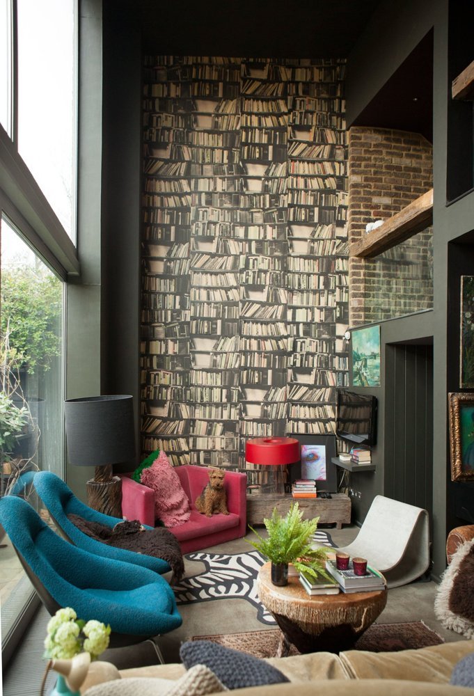
I recently noticed that Abigail was renovating a wall in her living room which has become a bit of the iconic Abigail design feature as I always think of this living room and the bookcase wallpaper as being very Abigail. When I saw she would be ripping it down, I had to ask her why and if she'd share the new feature wall with all of us today and she agreed - so here it is along with a short interview.
B E F O R E
A F T E R

Okay so my first question, why Superman? AH: My studio desk is on the balcony overlooking this wall, so I needed something inspiring. When I’m having one of my many conundrums or 12 hour working days, I can glance across at him and be reminded to never give up. Superman is my motivation! (Note: Painting is called, "Look! Up in the sky!" by artist Barbara Smith).
Why did you remove the bookcase wallpaper? AH: I’ve had the bookcase wallpaper for yonks, ever since I first painted the house dark. Although I really loved it I felt like it was time for a change with the darker palette. Plus the paint looked so beautiful on the walls I wanted everything in it. I ummed and ahhed a lot before doing it but now I wonder what took me so long!
Seems you went from colorful moody (before) to natural moody (after). What inspired the lack of color? AH: Nowadays I opt for a more reigned in colour palette and sophisticated glam vibe, rather than bright pops of colour. When I developed my paint range I painted the whole house out in my new colours, which are deeper, darker and more saturated than I'd ever gone before. Suddenly the bright pops looked a bit too garish for my liking! So rather than using colour, the wow factor now comes from either playing with scale (like the oversized art pieces and jumbo cactus) or from using intriguing texture and materials (the almost “caveman”-esque Dawlish console!)
What is the paint color and brand? Why dark with spring/summer approaching? AH: The paint colour is Madison Grey from my own paint range - a beautiful, bottom of the lake grey hue with undertones of green. It changes subtly with the light, and it's my all-time favourite, all year round. Plus in the summer all the greenery stands out beautifully against dark walls, with my forest-y garden beyond.
What inspired the green thumb? Are the plants real or faux? AH: Every single one of the plants are faux, from my new own-label. When I was designing my SS15 collection I took a cowboy theme and ran with it, so we have all these incredible desert-inspired botanicals and jumbo sized cactus. A huge delivery of the cactus turned up on my doorstep when we were working on the samples, and since then I’ve been obsessed with adding them to every room in the house.
Where is the credenza from and the print? AH: It’s the Dawlish sideboard from my store. The print, Lelia, is by photographer is Hannah Lemholt.
I love the placement of your tv – yours is so cleverly concealed. Can you give readers some tips on concealing a TV? AH: The TV is mounted on a swivel arm, so it can be tucked quietly away when we’re not watching it. It’s important for me to be able to disguise it, as I would never ever want the telly to be a feature! The simplest trick you can do when it comes to concealing TVs is to paint the wall out behind it in a dark hue (yes, I am on a mission to try to convert everyone to the dark side!)
What’s the secret of going dark and moody in a space without it feeling depressing? AH: That’s an easy one to answer, because I never find dark interiors depressing! They’re incredibly comforting and cocooning, while still being glam. The trick is to reign in the colour palette, and let the walls create all the drama. You also need to nail the lighting, and add a few more lamps than you normally would, but that is pretty much it.
What's in the pipeline for you Abigail (any projects we should look out for)? AH: My new book, COLOUR, is out on 23rd April. It’s a much bigger, fatter tome than my previous books, packed with my top tips for bold colours, and beautiful photos that we shot in some of the coolest homes around the world. I’ve wanted to do something on colour forever, so I’m really excited about it. I’m also in the process of tweaking my AW15 own label collection, whilst at the same time working on SS16 Finally, if I can squeeze it in we've got plans to take the Design School to Australia and American this year so its pretty full on!
Thanks Abigail for dropping in today - have a great weekend and much success on your upcoming book!
(images: top: Mark Wilson living room before: rebecca bond. living room after: Abigail Ahern)