
Open Thread: Color Theory
decor8 reader Sara Kaminski recently sent in a question that I thought I'd open up to all readers so everyone could join in and offer advice, resources, and what every design student needs: encouraging words. Here's what she had to say.
I'm an interior design student in St. Louis MO and a daily reader of your blog (it's awesome!). I just read your post about Tricia Guild and Color Theory. The program I am in is at the community college and we do not have a color theory course. I must say selecting colors is one of the things I am most insecure about. Can you recommend any books that I might be able to read to teach myself what I need to know?"
Sara
Yes, of course I can give you some advice. I actually am very surprised that this course isn't offered in your program, so I'll do my best to explain a little more here than simply pointing you to good books, especially since I didn't learn color theory solely through books. I'll try to recap some highlights from what I remember learning about color theory in school... I hope this helps.
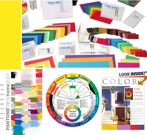
First, and you may already have these things, but purchase a color wheel (like this one) and a full set of Color-aid cards(314 colors). Ask your instructor if they have access to any. If not, contact your local art supply store. Color-aid cards are colored papers, both chromatic (hues) and achromatic (black/gray/white). I'll try to explain this without boring everyone to sleep. Each chromatic color is designated by a notation on the back of each card with information pertaining to its hue, lightness, and saturation category. For instance, if you pull a card from the deck in the 'yellow' family, you should know if it's a true yellow or a yellow-green or yellow-orange that you're dealing with. Also, what temperature the color is and what tint and tone it is of that particular hue. When you look at the color wheel, you'll see that true yellow comes in various tints and tones, and the cards will help you to view them in their purest form. These train your eye for spotting colors when you're out and about shopping for paint, textiles, etc. When using a color wheel along with the cards, you'll catch on to how this all works together. Certain hues and tones of hues just look better together, it's no accident when you see designer rooms or even magazine layouts with colors that harmonize so well. This, of course is a very short explanation as to the benefits of starting out with a color wheel and Color-aid cards, I'm sure once you purchase them and start playing around, you'll see what I mean. I can post some photos on my blog of a few color related projects that I worked on in relating to color theory from design school. Just let me know if that interests you or not.
Next, bookmark and refer often to Pantone. Pantone Inc. is the big color standards company, they unveil color forecasts for each season (well in advance). It's quite important for all designers to view the next 'it' colors for the season ahead. Pantone scours movies, advertising, magazines, websites, and other facets of pop culture to unearth color cues. They even survey art exhibits and socio-economic trends, considering even the state of the global economy (yes, really!). Since Pantone analyzes and sells colors to clients a few years in advance, they are able to poll them to discern popular choices so they can produce color planning guides that influence the mass-markets. Consumers don't catch word of what's hot in color often until a few YEARS later. To think most of us walked around for years thinking these trends just happened for no reason at all. Think again. Everything is calculated. Scary thought, but still critical for you to know and use as a guide in your design if you want to stay current. Click here to view the Fall '06 color trends in fashion. Most often, these trends are mirrored in home design, too (I always print mine out in color and keep it in a binder on my desk).
Pantone, Color-aid papers, and a color wheel are good places to start. In school, we also spent a good chunk of time painting with acrylic based paints. This is what really helped me to understand color - the hands on experience of actually creating them in various tints and tones. We weren't allowed to purchase the paint in yellow-orange for instance, we had to create yellow orange, and then as we muted the hue, we needed to create and add the perfect amount of achromatic color. I hope I'm explaining this right - I'm not a painter, but having had the classroom experience, I can positively say that for me, color theory only came together once I experimented with creating color by my own hand. We referred often to Painting with Acrylics by Wendy Jelbert and my favorite, Exploring Color by Nita Leland. Of course, Tricia Guild books were in constant rotation in the classroom, a real source of inspiration.
Once you've learned about color - tints, tones, shades, pastels, chromatic, achromatic, you then progress to an in-depth study of color relationships, which I found fascinating. We had to create morgue files filled with colors we clipped out of hundreds of magazines. We created books filled with examples of color relationships, for instance, an achromatic room, a analogous complementary color scheme, a narrow rectangular tetrad. In one project, we had to represent 26 color schemes from 13 basic relationships using magazines and our color-aid cards, complete with an index showing the color indicators on the back of the cards used in each relationship. In other words, design 26 rooms based only on the basic color relationships found on the color wheel, representing the rooms through color-aid cards and rooms from various magazines that fit the scheme perfectly. When studying color relationships, we were given tons of random handouts along with an in-depth consideration of Chapter 10 in our textbook, Interior Design by John F. Pile (his latest is V.3 I think).
Another part of learning Color Theory that I recall is the study of the Munsell system (of course), how we discern color, how color affects emotion and why, how colors are perceived on a global scale, the history of color... In fact, I'm guessing that you could study color everyday for a year and still have only a basic knowledge. To be known as a color expert, you need to have studied and applied your education for many years, which is why students often look to Tricia Guild.
Like all things, the best way to learn color theory after the basics are understood is hands on. Painting, creating color scheme boards, selecting colors from your morgue files and sitting on the floor for several hours shuffling them around, seeing what looks good to you and learning what colors you tend to be drawn to and figuring out why. All of this may seem overwhelming, but if you take it in steps it won't be. Give yourself time to absorb everything.
Additional tips:
Website: Color Matters, it explores color through a variety of disciplines: physiology, psychology, philosophy, and art.
Books I've read in addition to those cited above:
Color and Culture by John Gage
Colors for Your Every Mood by Leatrice Eiseman
Pantone Guide to Communicating with Color.
I hope all I have said helps you in some small way. If anyone else has comments that will assist design student, Sara, please post your comment below!
****
(images from pantone, dick blick, amazon, and color-aid)