
Stylist Randi Brookman Harris
I really enjoy browsing the portfolios of photographers and stylists online, I find them to be very inspirational and packed with decorating, color and placement ideas. Today I'd like to share views from the portfolio of Brooklyn-based stylist Randi Brookman Harris. I've been waiting for her portfolio to go live (the site wasn't ready last time that I checked) so I was excited to click over today and see it up and running. It looks great!
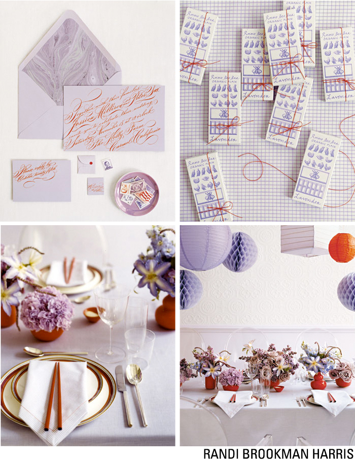
Randi's work has appeared in numerous publications and in ad campaigns -- she once styled for Kate Spade and has worked on numerous shoots for Martha Stewart Living and Weddings magazine. Aren't these colors sublime?
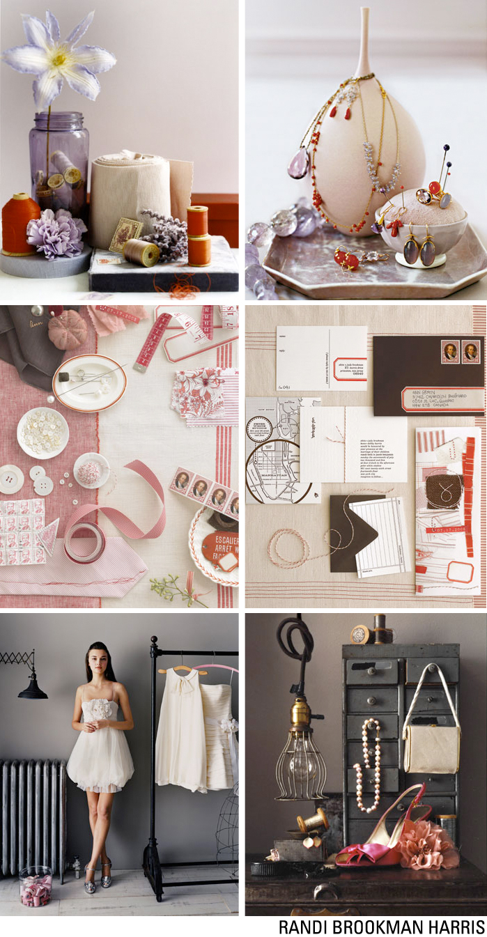
I don't know about you but I'm currently inspired by red, white and raw linen and for a more jazzy palette - I'm loving jewel tones, too. It's funny, I'm not a "red" person. I think it competes too much with my personality so I tend to shy away from using it in my home. I remember reading once in one of Shannon Fricke's books that she had red in her extroverted daughter's room and it affected her quite negatively, though her son didn't mind the color at all. She removed the red and her daughter's mood improved significantly. I believe color can have a strong impact on mood, and when I studied color theory I become even more aware of this fact -- it's not some decorator's myth or something, it's true. And so when I have red in my home, I feel very uneasy and my brain starts to race and I cannot concentrate. I've noticed this because I had red pillows and lamps several years back and really, really disliked them and stayed out of my bedroom (where they were) as much as possible. Then in my class, that same year, I learned about the power of color and so I purchased softer hues for my bedroom and instantly felt better there. In fact, it became my favorite room in the house once the colors were softer. I could think more clearly, my breathing slowed, I felt great and very peaceful.
But back to being inspired by red, white and raw linen... I tried to figure out why this is based on my own experience with red and well, I guess it has to do with shops I'm visiting here... it's everywhere! But aside from that, red, white and raw linen seem to be a good match for me as the color doesn't stress me out nearly as much when combined with white and raw linen. I guess the white cools down its heat and the linen adds a natural, relaxed feel to the palette. But I think I'll refrain from decorating with it so I don't go bonkers!
And I bet your favorite color is red right? And you think I'm hating on red now? he he. Well I'm not. I actually like it very much and find it to be very lovely but I cannot live with it in my home. And I wish I could. But no chance.
In additional to red, the seasonal themes here seem to be jewel tones, red/white/linen, purples and greens with brown, and another palette is gold and white. It's all so very pretty! I remember growing up, all you could find in stores in November and December... well take a guess. Pine green and bright red. That was it! Now, there are colors for every taste and style and I really appreciate this as I don't like to feel confined to use certain colors. And goodness, we need variety. Life is more exciting when you try different types of experiences!
So tell me, what colors are you seeing out there lately that really inspire you? Any specific palettes that have your attention?
(images: randi brookman harris)