
Color Crush For Spring
Want to talk about color for a minute? Good because wouldn't you know it, so do I! :) Designer Patty Murphy pulled together this nice print which gave me the whole inspiration to write this post. I thought the palette was great and could ultimately result in a gorgeous room scheme or even a nice outfit. What do you think?
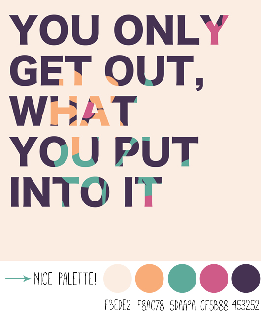
I added little dots below showing the key colors and also listed what they are in Photoshop terms if you are looking to use them in a project... I really adore these colors together though, it's a very glamorous and feminine mix. Add-in a little metallic copper or gold and you'd have something extra special. If you think the darkest tone you see is black (I think it depends on your screen), you may want to look again. It's really a truly deep, dark eggplant. Violet with orange, fuchsia and mint is trending for Spring fashion, have you noticed? If you haven't noticed, here is some inspiration from Breakfast at Yurmans below. I LOVE the pop of RED in this mix too. Wow.
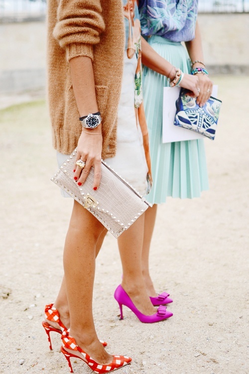
I am thinking that it may be time now to replace neon pink, which is being used everywhere, with accents of fuchsia and red instead. Seeing this photo above convinces me that mixing violet tones, red, mint green, peach, orange, beige, fuchsia and metallic copper could be an amazinggggg palette not only to wear but in the home - Oh yeah. You can even replace red with yellow - like a sunny yellow or mustard as shown below by fargerike.
Makes me dream of the possibilities, wow. What do you think of these colors together?
I'm in heaven!
(images: linked to their sources above.)